
Discover ‘Sweet Treats’: A warm neutral paint collection
We are delighted to announce the launch of a new capsule collection of colours. ‘Sweet Treats’ is a palette of nine delectable paint colours, including eight new shades and one existing Little Greene colour…
This curated collection of paint colours brings warmth and comfort to your home. ‘Sweet Treats’ comprises a selection of warm neutral shades of honey, caramel and chocolate. These hues will allow you to create cosy and enveloping interior schemes that appeal to all the senses.
The collection includes both trend-led colour creations and time-honoured shades. The historic colours have been accurately recreated from walls, woodwork and furnishings at a number of places in the care of the National Trust.
Shop the 'Sweet Treats' collection online or learn more about the colours below.

Which shades are part of the ‘Sweet Treats’ collection?
The ‘Sweet Treats’ palette features eight tempting new shades. These shades include sophisticated golds, Madeleine and Bombolone, on-trend caramels, Galette and Affogato, soft muted pinks, Split Pink and Mochi, the terracotta-toned, indulgent Muscovado and the rich chocolate Ganache. The wonderfully rich Little Greene favourite, Chocolate Colour, completes the Sweet Treats collection.
How to use ‘Sweet Treats’ paint colours in the home
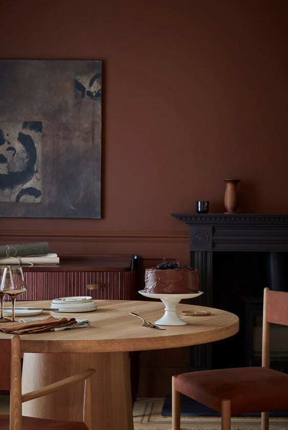
Perfect for use in all-over schemes in both contemporary and traditional settings, these delightful neutral hues work wonderfully in colour drenched schemes. You can also pair them with deeper browns and blacks to create a captivating, sophisticated interior. Soft, warmer whites will elegantly complement these shades for a traditional feel, or they can be used to support a brighter, contrasting colour highlight for a more contemporary and dynamic look.

Our Creative Director, Ruth Mottershead, says:
“Earthy shades, particularly browns, have historically been used for their practicality, and are often dismissed as being dated or dull. However, rich warm colours based on umber and ochre deliver cocooning, restful and charming spaces. Deeper, richer caramels are perfect for creating enticing and sumptuous spaces, whilst soft golds provide comfort and reflect the desire to create warmth within our homes.
We have had a lot of fun developing this capsule collection. The ‘Sweet Treats’ palette aims to challenge the perception that browns are outdated and unusable, providing delicious hues that bring elegance and sophistication to any interior. If these tasty tones aren’t enough to indulge your senses, we have created a series of tempting recipes celebrating each colour too.”

Delve deeper into the Sweet Treats colours…
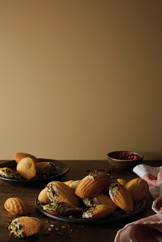
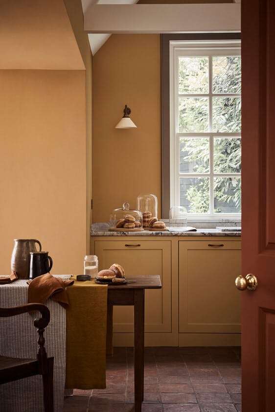
Madeleine

Walls, Dado Rail & Panel: Madeleine, Ceiling & Architrave: Linen Wash, Door: Portland Stone
This muted gold colour elegantly serves the space between muted-yellow and warm-neutral.
Madeleine takes its name from the delicate, shell-like sponge cakes which were enjoyed by the French romantic writer Marcel Proust, as a boy. They are later referenced in his monumental literary work ‘In Search of Lost Time’. ‘Madeleine de Proust’ has subsequently become an informal term for a childhood memory triggered by the senses.
Make your own delicious Madeleines with our easy-to-follow recipe.
Pair with...
Use Madeleine as the main wall colour in a calm, welcoming space. Incorporate Bombolone or Bassoon on the trim as a darker complementary tone for a contemporary interpretation of this charming neutral yellow.


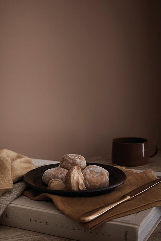
Bombolone

This mellow, honeyed shade is inspired by bomboloni, the signature Italian doughnuts.
Traditionally eaten for breakfast instead of a pastry, as a snack with a coffee, or as an indulgent afternoon treat, they are fried, rolled in sugar and filled with jam or ‘crèma pasticciera’.
Have a go at creating your own homemade bomboloni with our simple recipe!
Pair with...
Bombolone is gently complemented by Stock or the elegant neutral Silt, and can be contrasted with a small pop of Marine Blue or Woad.


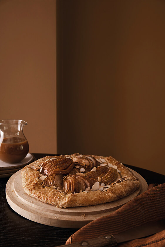
Galette
This mid-weight orange-brown shade was faithfully reproduced for the stage doors at one of the only surviving Regency playhouses in Britain; Theatre Royal in Bury St Edmunds.
Cheaper to produce and good at concealing dirt, brown tones such as Galette were functional and popular choices in 1819. Fast-forward 200 years and this shade has become the epitome of good taste, its autumnal undertones make it an excellent colour to use alongside rustic natural finishes, be they oak or darker woods, and stone or quarry tiled floors.
Discover our Pear Galette recipe.
Pair with...
Add a highlight of brighter colour with Mister David in a contemporary scheme, or Yellow-Pink in a more classical interior.


Split Pink

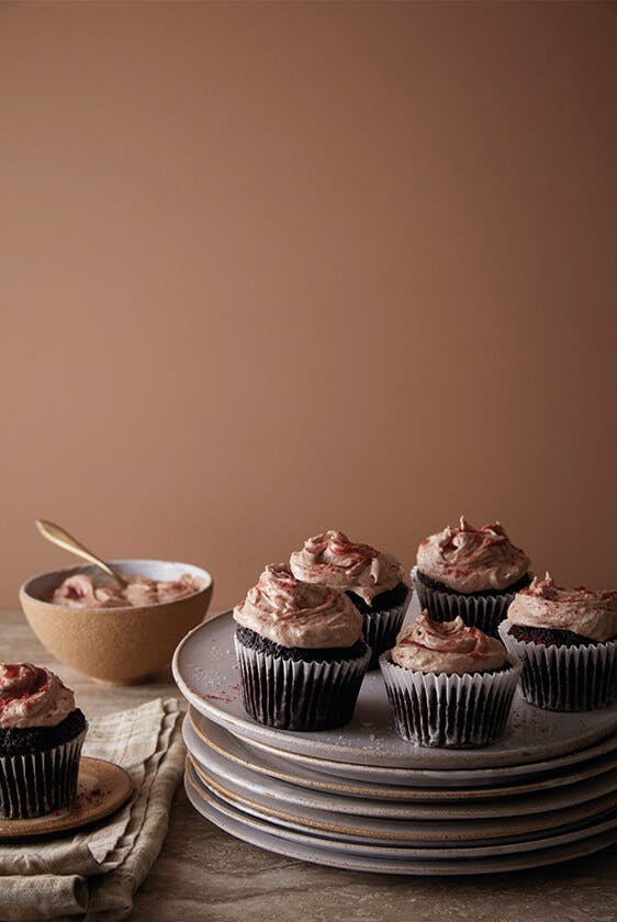
Walls: Spilt Pink, Skirting & Architrave: Attic II, Ceiling: Roman Plaster
An elegant warm stone colour, this pink has, for generations, adorned the walls of the great staircase of Wimpole Hall in Cambridgeshire.
Split Pink effortlessly harmonises with the various shades of the lighter colour, Masquerade.
Try our delicious Split Pink cupcakes, with a split raspberry jam and chocolate cream cheese icing which was inspired by the process of recreating this historic colour.
Pair with…
Attic II makes for an excellent bedfellow, and it also pairs beautifully with charismatic dark blues and greens; try Dock Blue, Basalt or Obsidian Green for a bit of drama.


Affogato

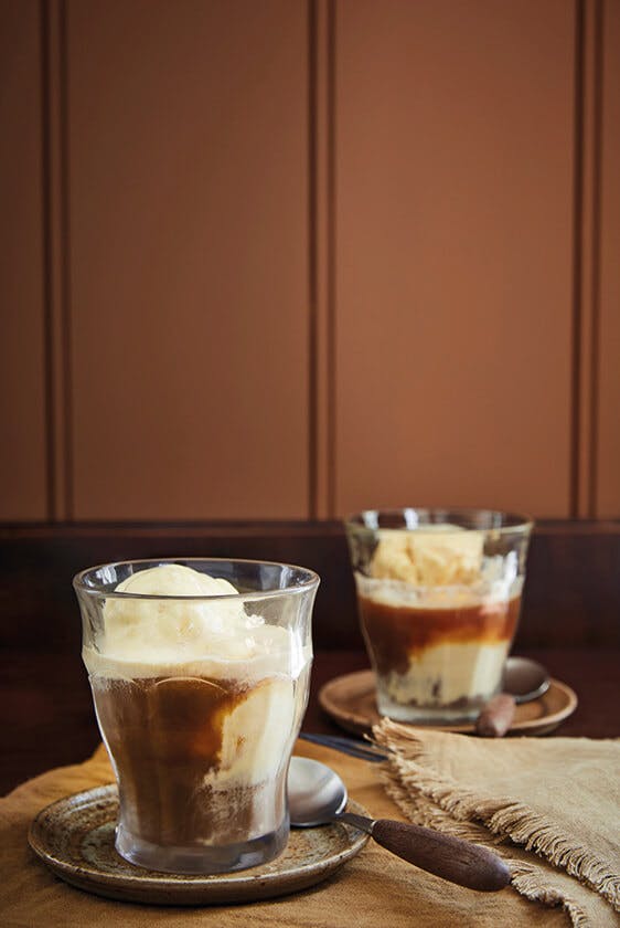
Walls: Affogato, Ceiling & Window Trim: Slaked Lime - Mid
Efficiently and expertly combining coffee and dessert in one mouthful (or, more politely, several mouthfuls), Affogati originated in Italy in the last century and are enjoyed the world over.
Find out how you can create this rich Italian indulgence in an instant.
Pair with...
This shade makes for an excellent partner to dark browns and soft blacks – use it with Lamp Black and dark furniture to create a captivating, sophisticated scheme in a casual living space.


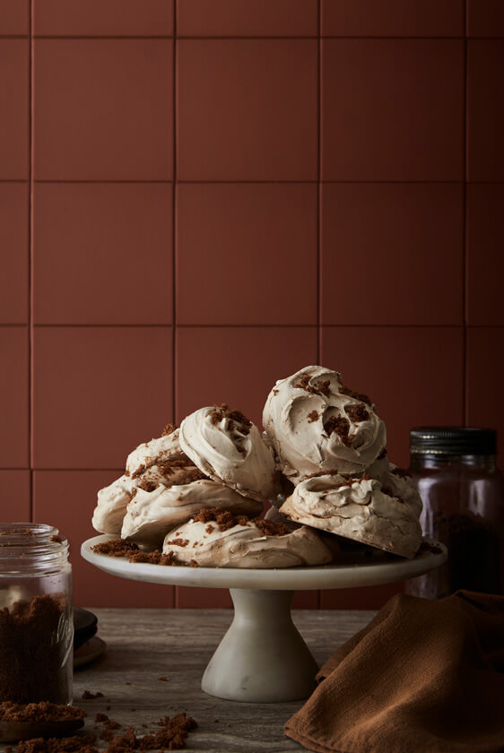
Muscovado
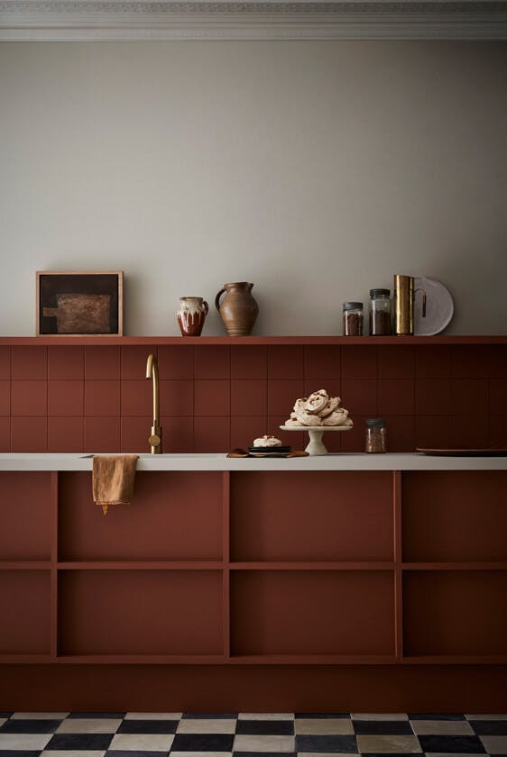
Kitchen Units & Tiled Splashback: Muscovado, Wall: Slaked Lime - Dark, Cornice: Slaked Lime - Mid
Inspired by pure and unrefined muscovado sugar – a key ingredient in artisan bakery – this rich, deep, warm, earth-red is perfect for an indulgent space.
Try our Muscovado Meringues recipe for a delicious and versatile dessert.
Pair with...
Frame it with one or more of the neutral Slaked Lime Colour Scales family and your extremely tasteful scheme will be as popular as our Muscovado Meringues.


Mochi

The decoration and cameos on the walls in the dining room of Calke Abbey, where this Mochi shade accompanies several other pinks, greens and greys, was designed in the late 18th century.
Unlike much of the property, which the National Trust has preserved in the state of decline in which it was acquired in 1985, this dining room has been restored to its original neoclassical design, providing a tantalising glimpse of the mansion’s former glory.
Pair with...
Use Mochi to create a more contemporary, coordinated dining room or office space, alongside the deeper colour Scullery – on skirting boards and doors – and Shirting or Slaked Lime on the ceiling.


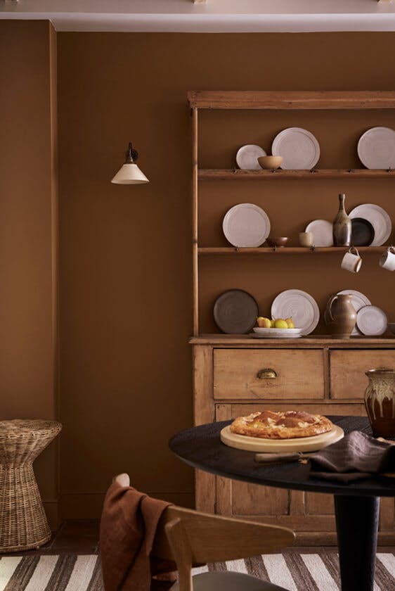
Ganache
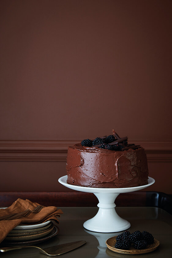
Walls & Dado Rail: Ganache
In French folklore, the word Ganache was originally coined as an insult by an angry head chef in 1920s Paris.
The resulting happy accident was the blend of rich chocolate and hot cream that features so profoundly in today’s patisseries. As a paint shade, it was revealed as one of several colours in an intricately painted ceiling at Blickling Hall in Norfolk, boarded over in the early 20th century and rediscovered after a flood nearly a hundred years later.
Try making the decadent ganache that inspired this colour with our showstopper Ganache Cake.
Pair with...
With its enviable profundity, Ganache is likely to be the darkest shade in your room scheme, but consider pairing it with the even darker Chocolate Colour for a deeply committed interior design statement.


Chocolate Colour

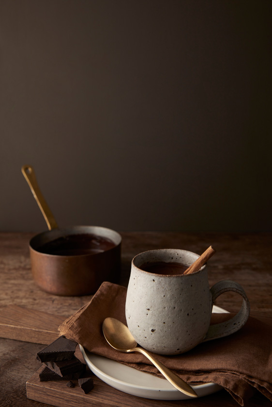
Walls: Chocolate Colour, Bath: Rolling Fog - Dark
The only existing Little Greene colour in the Sweet Treats capsule collection, it is believed that both George Frideric Handel and Benjamin Franklin had their London front doors painted in this rich, almost edible shade.
The deepest of the shades in this capsule collection, Chocolate Colour works equally well inside. Use it as a warmer alternative where you might previously have considered black, charcoal or a dark blue.
Satisfy all your chocolate cravings with our warming Cinnamon Hot Chocolate recipe.
Pair with...
Brighter accents such as Marigold or Orange Aurora will leap off a Chocolate Colour background, or use it as an exquisite trim colour to frame a wall of Arras or Tuscan Red.


Discover the 'Sweet Treats' collection.
Explore all our Sweet Treats recipes on our Little Greene Recipes Page.


