

Considering the Orientation of a Space
When selecting a shade for your home, the orientation of the room is a big consideration.
The amount and direction of light entering a room can completely alter the appearance of a colour. Once you have created a shortlist of options from our colourcard, we always recommend sampling the colours in situ to ensure you select a colour that sits comfortably in your scheme.
Whether a space is bathed in natural light or has vastly changing light throughout the course of the day, the orientation of each room should be considered separately to ensure that you pick a shade that complements the space.
South Facing Rooms
South facing rooms tend to experience warmer light, so colours can often appear more yellow. This means cooler whites such as 'French Grey Pale' or 'Gauze' will read as more neutral whites. Warmer whites such as 'White Lead' or 'First Light' will appear quite cream in tone.
Strong, bold yellows like 'Yellow Pink' or 'Mortlake Yellow' will radiate warmth, whereas dark blues like 'Marine Blue' and 'Hicks' Blue' can be used in place of greys and blacks to achieve a neutral scheme with more depth.
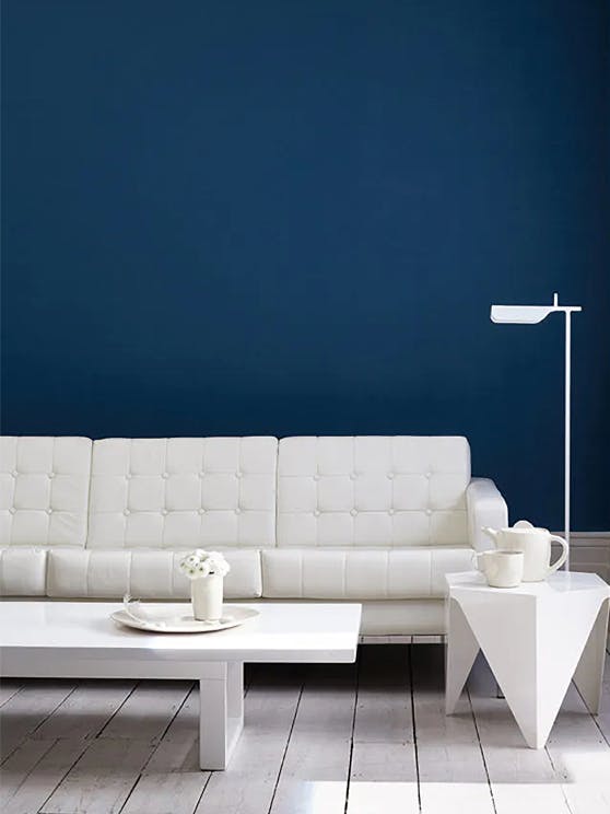
Wall: Royal Navy 257
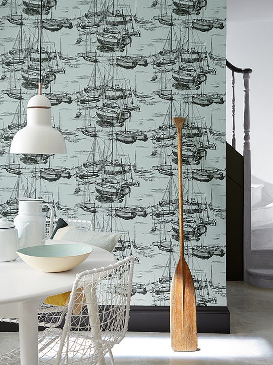
Walls: Zingara – Cerulean Sea
Skirting & panelling: Jack Black 119
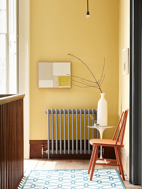
Wall: Light Gold 53
Radiator: Urbane Grey 225
Architrave: Scree 227
Chair: Heat 24
Window Frame: White Lead 74
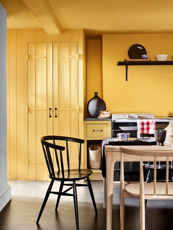
Ceiling: Giallo 337
Walls: Giallo 337
Cupboard: Giallo 337
Left Wall: Bone China Blue – Faint 325
North Facing Rooms
Colours in North facing rooms tend to appear consistently flatter and cooler than they would do bathed in natural light. Paler blues and greens may appear cold but experiment with stronger green-blues such as 'Air Force Blue' or 'Canton' for a warming impact. If you're looking for something more neutral, shades with a pink or yellow undertone such as 'Rolling Fog' or 'Stock' provide an uplift when used in an all-over scheme.
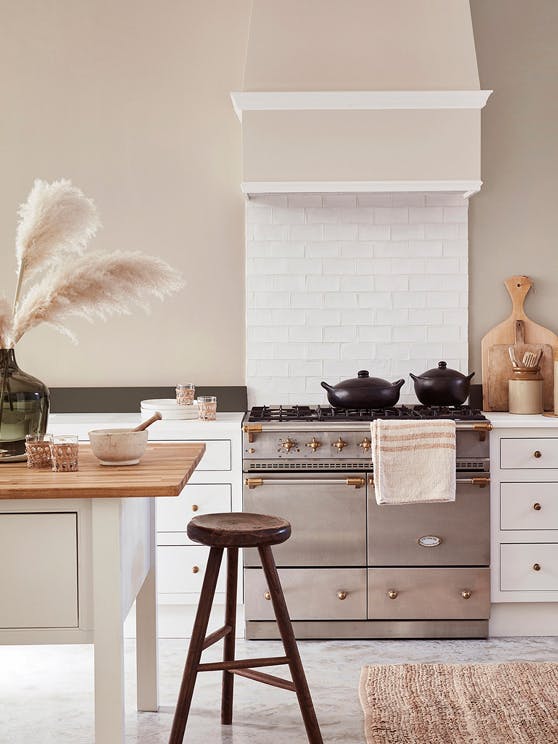
Wall: Mushroom 142
Splash Back: Pompeian Ash 293
Kitchen Units: Flint 236
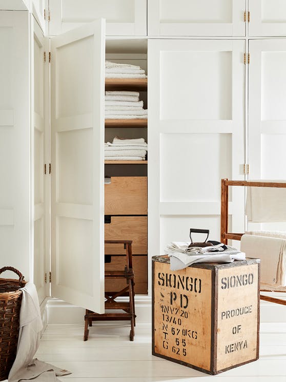
Woodwork & Walls: Linen Wash 33
West Facing Rooms
The natural light in West and East facing rooms changes dramatically throughout the day, so the function of the room is an important factor. Maximise the changing light by varying the strength of shades used within the neutral colour scheme. The 'Colour Scales' families provide four strengths of the same pigment which can be used in combination for a harmonious scheme. Utilise bold accent colours on architectural features or woodwork for a strong highlight.
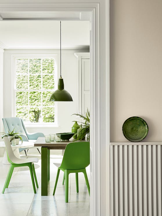
Far Wall: French Grey – Pale 161
Right Wall: Portland Stone – Dark 157
Woodwork: French Grey – Pale 161
Chairs: Sage & Onions 288
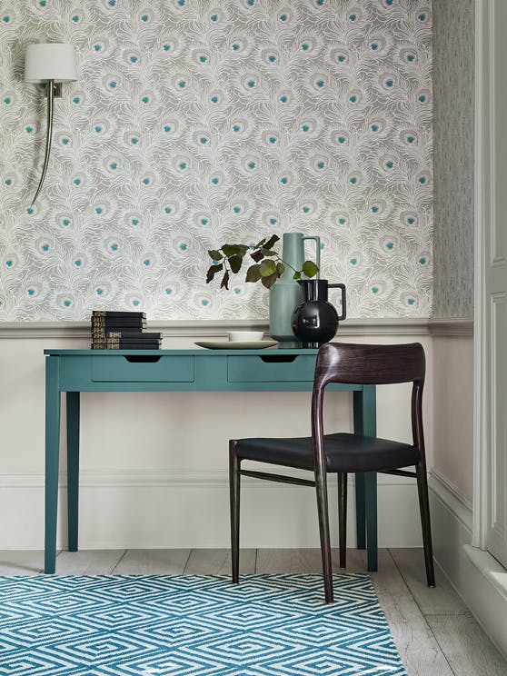
Wall: Carlton House Terrace – Pompon
Desk: Tea with Florence 310
Dado Rail: French Grey – Dark 163
Lower Wall: French Grey – Mid
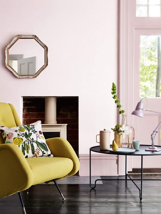
Wall: Dorchester Pink – Mid 286
Door and Woodwork: Dorchester Pink 213
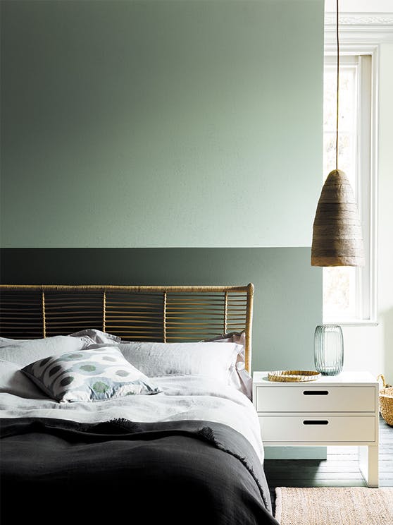
Top: Aquamarine 138
Bottom Half: Ambleside 304
Back Wall: Aquamarine – Pale 282
East Facing Rooms
If the bedroom or perhaps kitchen faces East then make the most of the morning light with a strong or radiant colour to wake up to. Neutrals with a cool, blue or green undertone will help to create balance and will appear more subdued and restful in the evening light.
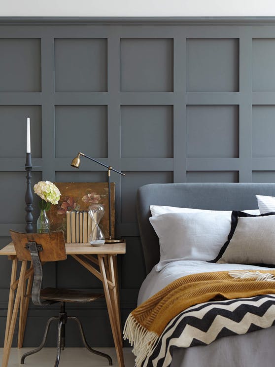
Wall (panelled): Scree 227
Wall (above): Shallows 223
Flooring: Shallows 223
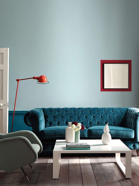
Wall: Celestial Blue 101
Below dado rail: Marine Blue 95
Picture frame: Bronze Red 15
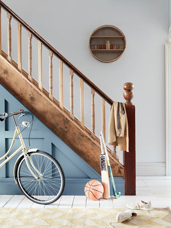
Walls: Mono 218
Panelling: Juniper Ash 115
Woodwork: Wood Ash 229
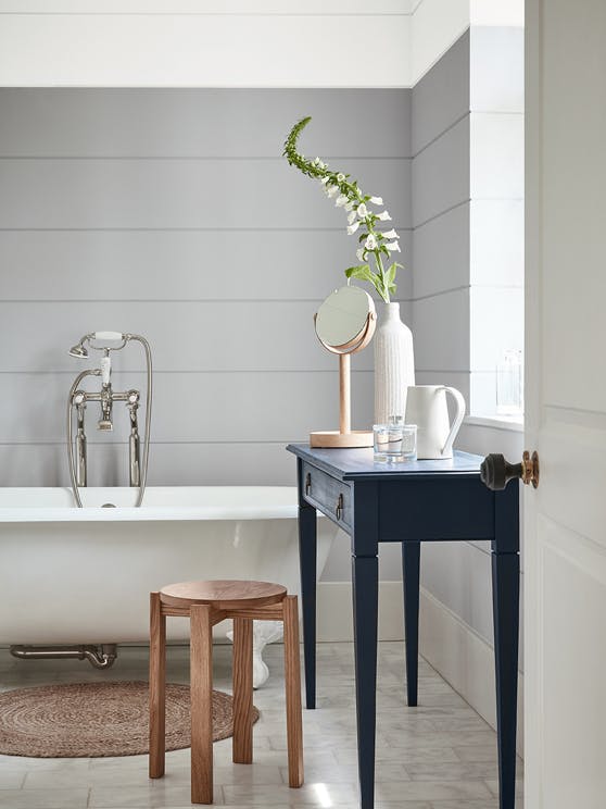
Upper Wall: Gauze 106
Lower Wall: Gauze – Dark 166
Side Table: Basalt 221